Key takeaways:
- Learn why checkout optimization is key to improving conversions and reducing cart abandonment.
- Discover 10 actionable tips, like mobile optimization and offering multiple payment options, to enhance the checkout process.
- Find out how Gofrugal can streamline and optimize your checkout experience for better results.
So much effort goes into building your ecommerce store, but then what happens? The checkout rate is low. This isn't an opinion or judgment; it's a statistical fact. According to recent research, the average online shopping cart abandonment rate is 70.19% (source: Baymard Institute). There are many elements and factors that come into play before a checkout happens that lead to poor conversion rates. Optimizing your ecommerce checkout process becomes critical to battle against this.
This guide will help you better understand checkout optimization and offers 10 checkout optimization tips that you can execute right away to help increase your conversion rate.
Contents
- What is checkout optimization?
- Why does checkout optimization matter?
- 10 checkout optimization tips to get you started
- Simplified navigation
- User-friendly form design
- Transparent policies
- Mobile optimization
- Security and trust badges
- Progress indicators
- Multiple payment options
- Make editing the cart easy
- Make sure products are available
- Offer real-time assistance
- How Gofrugal can help with checkout process optimization
What is Checkout optimization?
Checkout optimization is the process of improving the final steps of an online shopping experience to make it faster, easier, and more user-friendly for customers. It focuses on reducing any friction that might prevent a customer from completing their purchase. By enhancing the checkout process, businesses can increase checkout conversion rates and ensure more shoppers complete their transactions.
An effective checkout optimization guide involves streamlining forms, minimizing steps, and offering multiple payment options to create a seamless experience. This ensures that your customers can shop hassle-free while boosting your sales.
Importance of optimizing checkout process
Optimizing the checkout process is crucial for reducing cart abandonment and improving customer satisfaction. An effective checkout experience ensures that customers face minimal obstacles when completing their purchases, which directly impacts your revenue and conversion rates.
Here’s why checkout process optimization matters:
- Reduces cart abandonment: A complicated or time-consuming checkout can discourage customers. Making this process better helps retain buyers who are ready to purchase.
- Increases conversion rates: When the focus is on checkout conversion optimization, more customers are likely to complete their transactions, improving your overall sales performance.
- Improves user experience: A smooth checkout process optimization leaves a positive impression on customers, encouraging repeat purchases and boosting customer loyalty.
- Accommodates diverse payment preferences: Including multiple payment options caters to a wider audience, ensuring convenience for every shopper.
- Supports mobile shoppers: With the rise of mobile shopping, an optimized checkout process ensures a flawless experience across all devices, reducing drop-offs.
Challenges in the Checkout Process
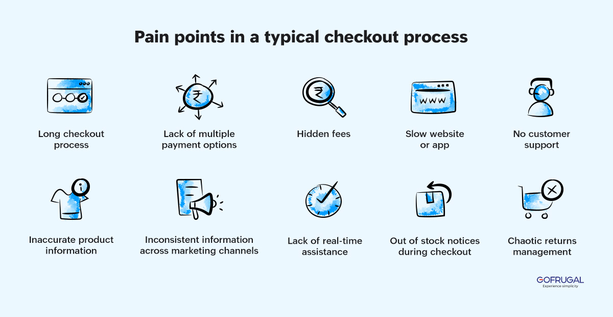
A poorly designed checkout process can lead to frustration, cart abandonment, and lost revenue. Businesses often face various challenges while ensuring a smooth and effective checkout process optimization. Identifying and addressing these hurdles is key to improving checkout conversion optimization and creating a seamless shopping experience.
Here are the common challenges in the checkout process:
- Lengthy forms: Requiring customers to fill out excessive details can slow down the process and deter them from completing their purchase.
- Lack of payment options: Limiting customers to a few payment methods may prevent some shoppers from completing their transactions.
- Mobile responsiveness issues: A checkout process that isn’t optimized for mobile devices can lead to drop-offs, especially with the increasing number of mobile shoppers.
- Hidden costs: Unexpected fees or unclear pricing during checkout can cause customers to abandon their carts.
- Complicated navigation: A confusing layout or unclear instructions can frustrate customers and disrupt their checkout flow.
- Security concerns: If the checkout process doesn’t instill trust with secure payment options and visible assurances, customers may hesitate to complete the purchase.
How to Optimize the Checkout Process for Conversions: 10 Tips
These 10 checkout optimization tips can help your shoppers complete their checkout.
Simplified navigation
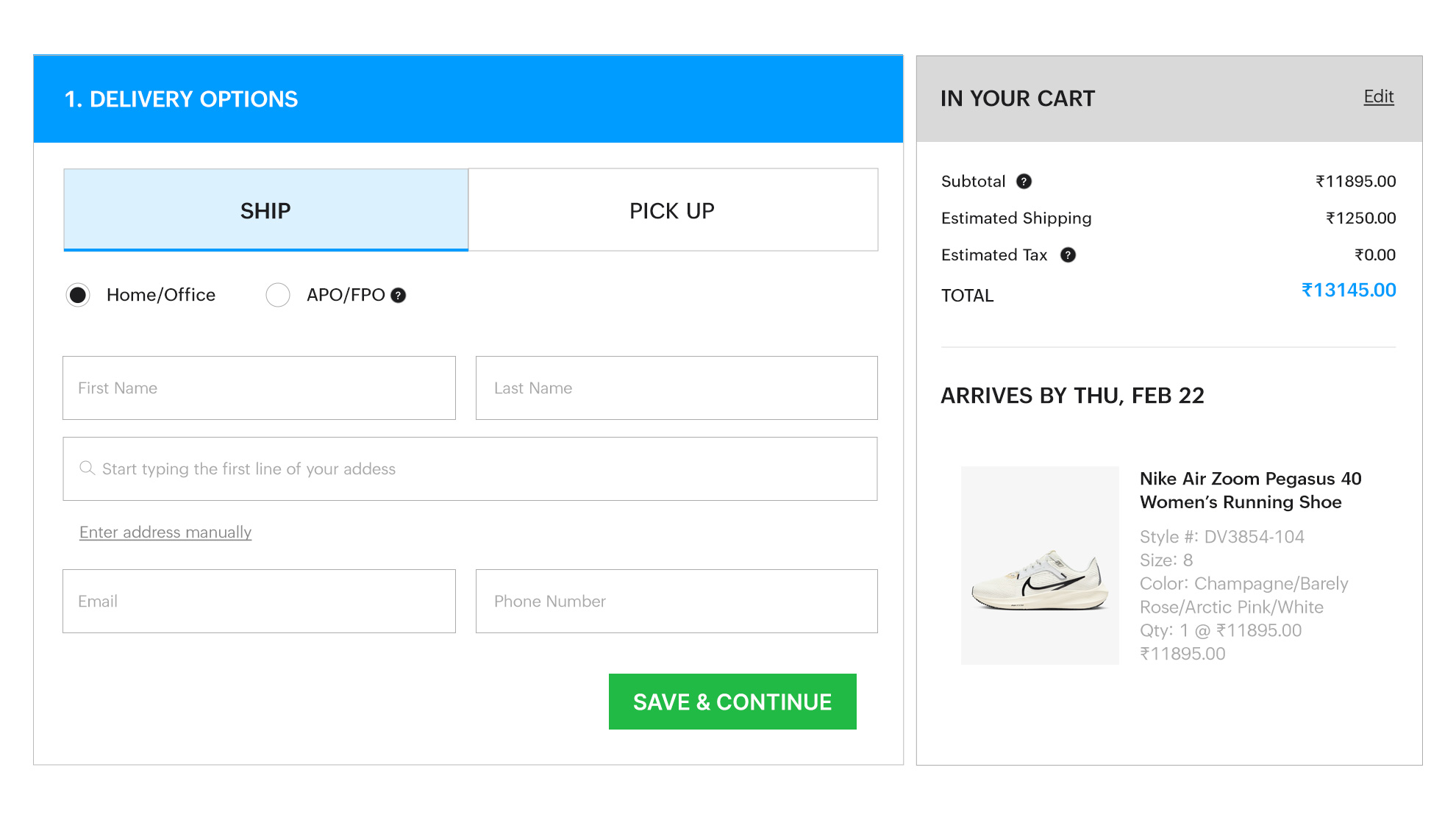
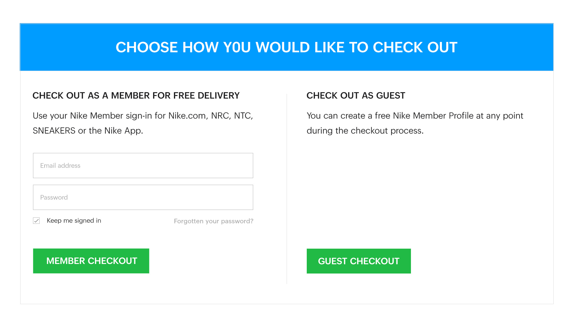
Create a distraction-free online checkout experience for your visitors to enhance your checkout process optimization. Remove unnecessary elements such as navigation headers and footer menus, directing your customers' focus solely on completing the checkout process. Alternatively, include only essential details, such as shipping options and payment processor information, to improve clarity and trust.
Here is a template that you can start with:
User-friendly form design
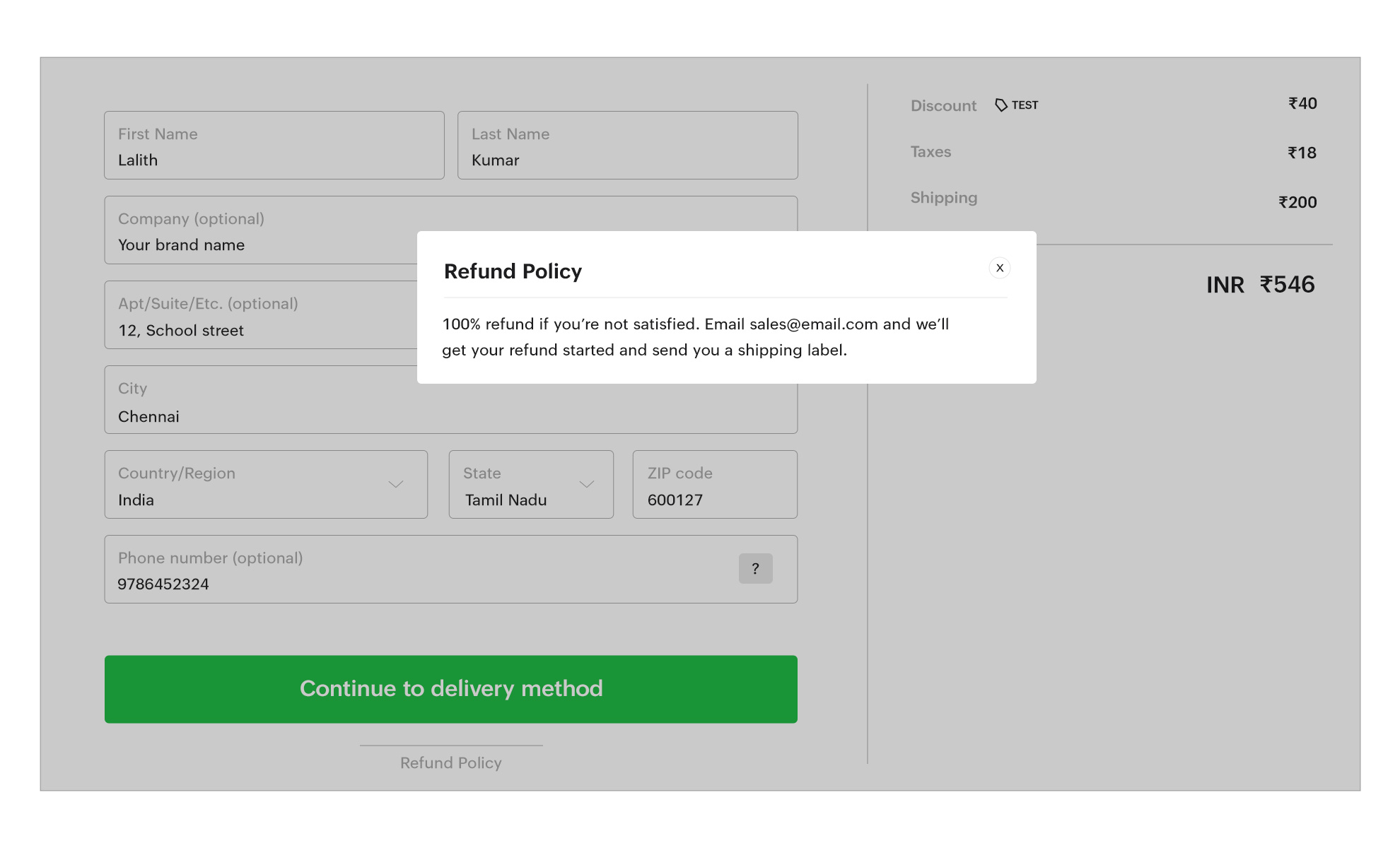
Research shows that simplifying forms by reducing the number of required fields significantly enhances the user experience during checkout. By focusing on checkout process optimization, businesses can make it easier for customers to complete their purchases. For example, allow customers to indicate if their billing and delivery addresses are the same, minimizing the effort required.
Here is a template that you can start with:
Transparent policies
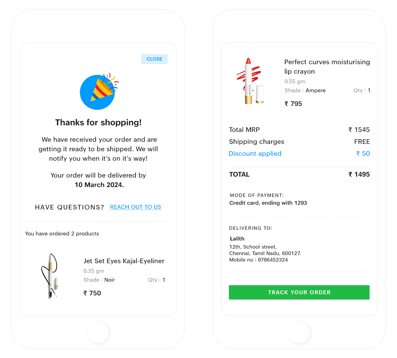
Transparency is key to building trust and boosting checkout conversion rates. Providing clear information about return policies, shipping details, and customer support instills confidence in shoppers. Studies show that 81% of buyers value transparent policies when making purchasing decisions, making this a critical component of your checkout optimization guide.
Here is a template that you can start with:
Mobile optimization
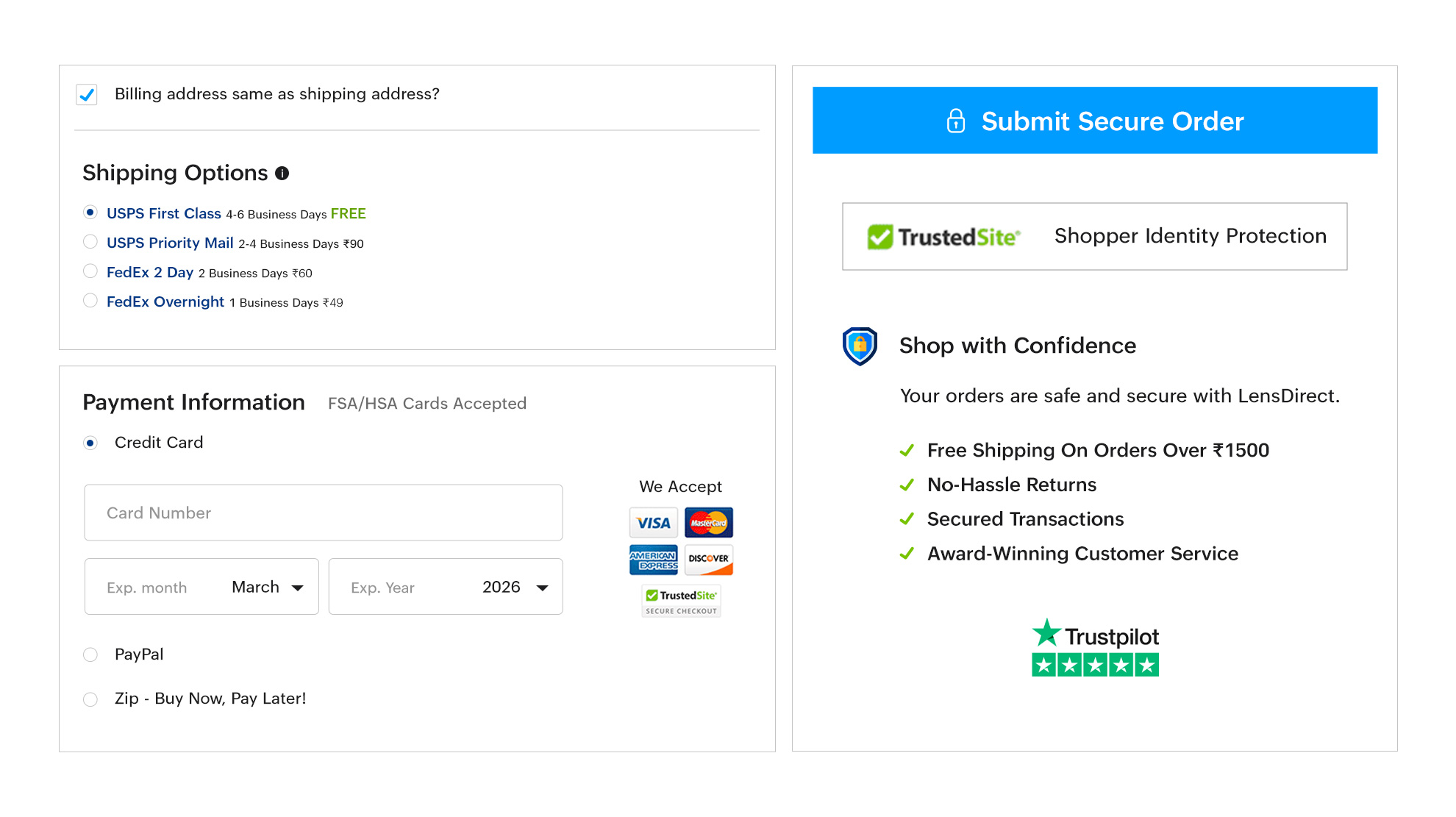
Mobile devices are essential for online shopping, and optimizing your checkout process for mobile users is crucial. Ensure clear and compelling call-to-action (CTA) buttons are easily clickable on mobile screens, guiding users to complete their purchases effortlessly.
Here is a template that you can start with:
Security and trust badges
Trust is a critical factor in checkout conversion optimization. Display security badges, SSL certificates, and trust seals on your website to assure customers of a safe and secure checkout process. This reassurance encourages shoppers to proceed with their purchases confidently.
Here is a template that you can start with:
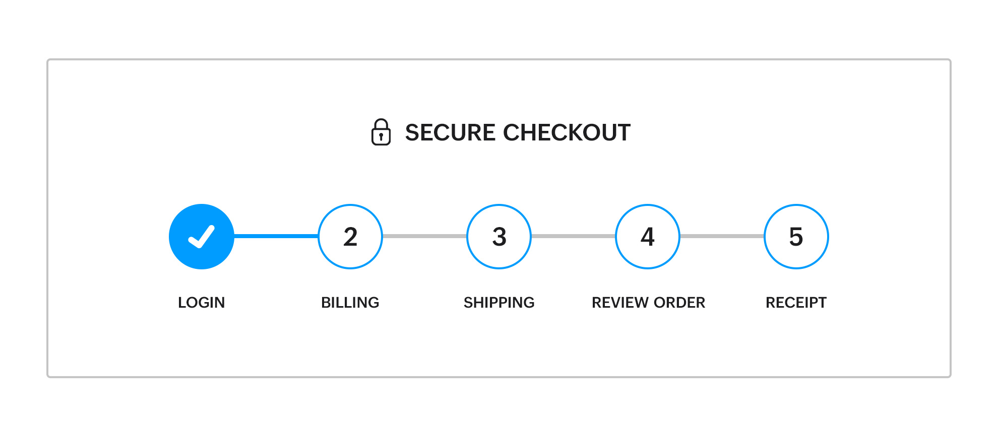
Progress indicators
Progress indicators guide customers by showing their position in the checkout process, reducing uncertainty and enhancing the user experience. Clear steps and visual cues can lower cart abandonment rates by up to 18%.
Visual road map: Progress indicators create a visual roadmap, providing customers with a clear understanding of their position in the checkout process. These visual cues not only reduce uncertainty but also enable users to anticipate the remaining steps. Studies suggest that adding such indicators can contribute to an 18%(source: Drip) in cart abandonment rates.
Steps remaining: Clearly communicate the number of steps left in the checkout process. Whether it's a three-step or four-step procedure, make this information evident to the user. This transparency helps manage customer expectations, fostering a sense of control and understanding throughout the checkout journey.
Here is a template that you can start with:
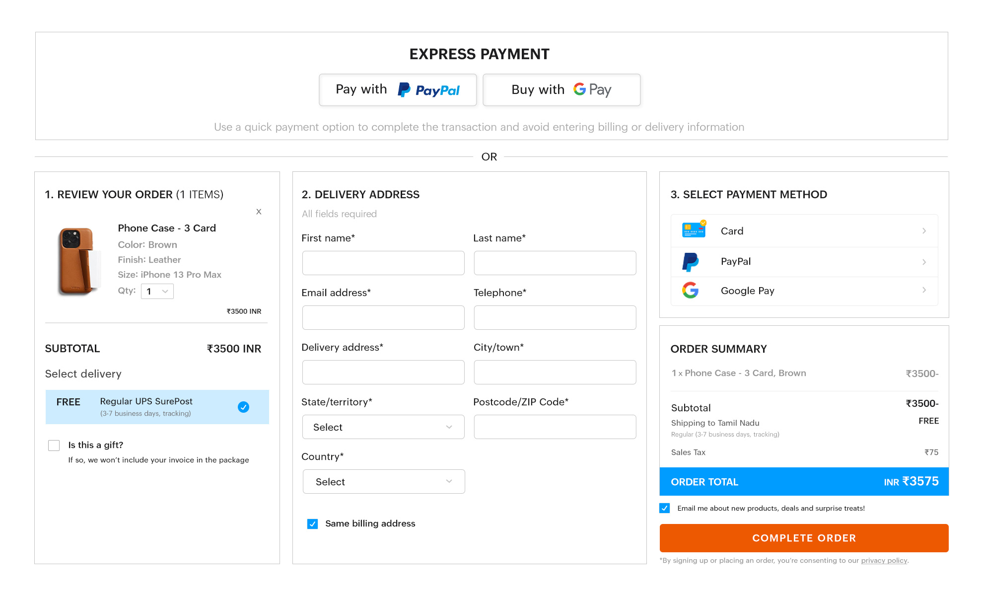
Multiple payment options
Offering various payment options, including credit cards, digital wallets like Google Pay, PayPal, and PhonePe, caters to diverse customer preferences. Flexibility in payment methods significantly reduces cart abandonment and improves the overall checkout process optimization.
Here is a template that you can start with:
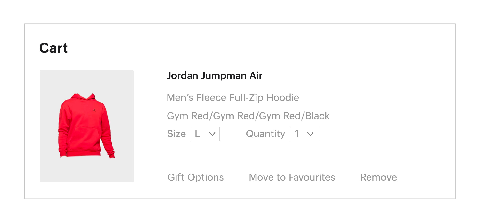
Make editing the cart easy
Allow users to update item quantities or remove items directly from the checkout page. This feature ensures a smoother checkout process, minimizes frustration, and reduces cart abandonment.
Here is a template that you can start with:
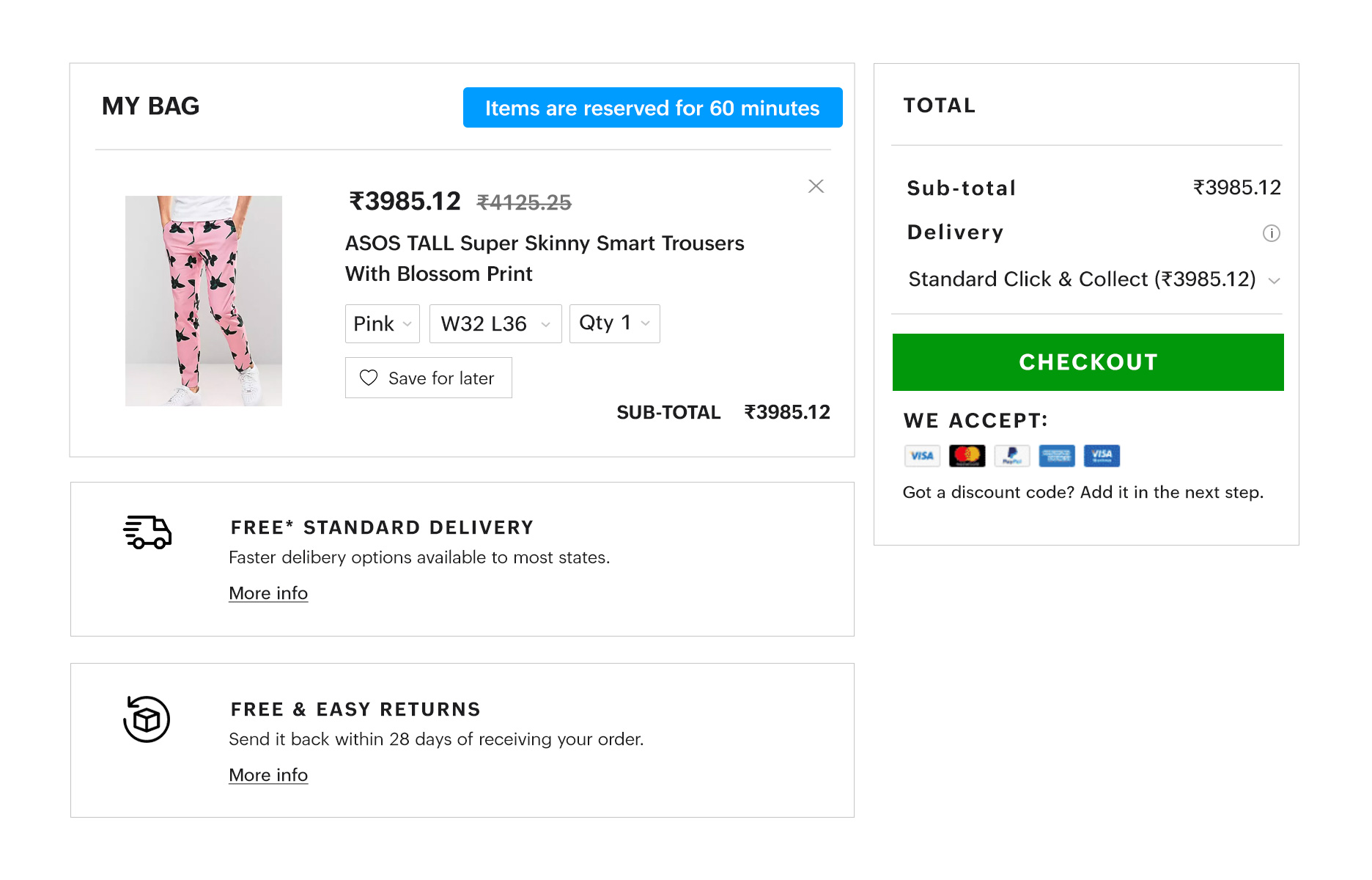
Make sure products are available
Nothing is more frustrating for customers than discovering an item is out of stock during checkout. Always display stock availability on product pages to manage customer expectations and enhance your checkout process optimization.
Here is a template that you can start with:
Offer real-time assistance
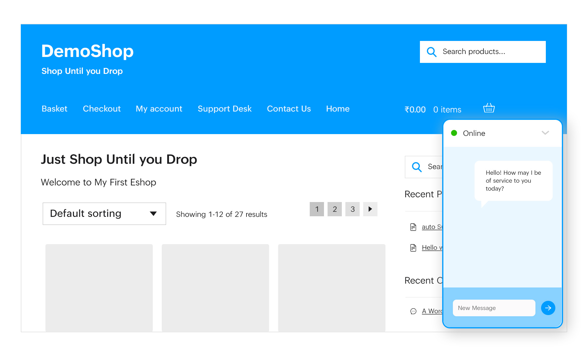
Providing real-time support, such as live chat, helps customers resolve issues instantly, ensuring a smoother checkout process. Investing in dedicated customer support teams can boost satisfaction and increase conversions.
Here is a template that you can start with:
How to handle cart abandonment?
Cart abandonment is a significant challenge for online businesses, but with the right strategies, it can be effectively minimized. By addressing common pain points and improving the checkout process optimization, businesses can encourage customers to complete their purchases and boost conversions.
Here are actionable tips to handle cart abandonment:
Simplify the checkout process
Streamline forms, reduce the number of steps, and eliminate unnecessary fields to make the process quick and user-friendly.
Offer guest checkout
Avoid forcing users to create accounts. Allowing a guest checkout option makes it more convenient for first-time customers.
Be transparent about costs
Display all fees, including shipping and taxes, upfront to prevent surprises at checkout.
Provide multiple payment options
Cater to diverse customer preferences by offering a variety of payment methods, including credit/debit cards, wallets, and UPI.
Use cart abandonment emails
Send friendly reminders to customers who leave items in their cart, and include incentives like discounts or free shipping to entice them back.
Optimize for mobile devices
Ensure the checkout process is mobile-friendly to cater to the growing number of mobile shoppers.
Add trust signals
Display security badges, SSL certificates, and clear return policies to reassure customers about the safety of their transactions.
Leverage retargeting ads
Use retargeting campaigns to remind customers of their abandoned carts and encourage them to complete the purchase.
How Gofrugal can help optimize checkout process?
Gofrugal helps you with checkout process optimization by integrating directly with your favorite eCommerce platforms. You can connect your physical store, online store, and marketplace presence all in one place without human intervention, offering a more personalized experience to consumers. Here are some top benefits of using Gofrugal's eCommerce integration capabilities for enhancing the checkout process:
- Centralized product catalog management: Streamline product updates for accurate and consistent details across all channels, improving the overall shopping and checkout experience.
- Efficient order management: Accelerate order processing and fulfillment to enhance customer satisfaction and ensure smoother checkout conversion optimization with speedy transactions.
- Comprehensive customer management: Provide cross-channel customer service, offering a smooth shopping journey with options for online purchases, in-store pickups, and hassle-free returns.
- Operations management excellence: Manage offers, prices, promotions, and inventory efficiently, all from a single, unified back office. This holistic approach improves the overall shopping experience and boosts checkout conversion optimization.
Checkout optimization is the culmination of carefully crafted strategies aimed at enhancing the shopping experience. With Gofrugal, you can simplify the checkout process while reducing cart abandonment and improving customer satisfaction. By conducting regular A/B testing and refining your strategy, you can achieve a heightened checkout conversion rate and sustained business growth.
Recognizing the importance of convenient payment methods helps simplify the checkout stage. By providing easy and affordable payment options, you can significantly minimize friction, ensuring customers reach the finish line faster. Embracing these checkout page optimization tips not only reduces barriers to purchase but also establishes a foundation for long-term success in the dynamic world of ecommerce.
If you want to learn more about improving the customer experience in the retail industry, click here!
FAQs
What is the checkout process?
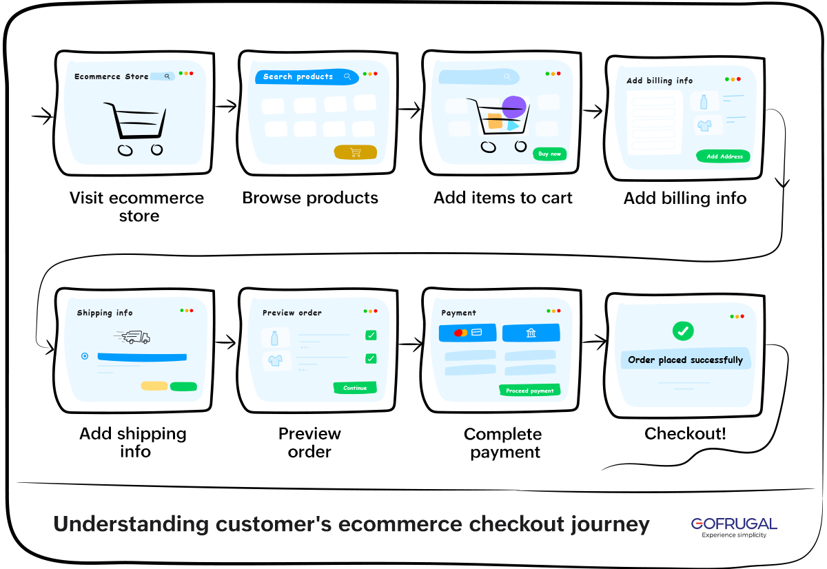
The checkout process refers to the final steps a customer takes to complete their purchase in an online store. It typically involves reviewing the cart, entering shipping and payment details, and confirming the order. A smooth and efficient checkout process optimization ensures that customers can complete these steps without frustration or delays.
What is checkout conversion optimization?
Checkout conversion optimization is the process of improving the checkout experience to increase the percentage of shoppers who complete their purchases. This involves minimizing distractions, simplifying forms, offering multiple payment options, and ensuring a seamless user experience. Effective checkout optimization directly impacts sales by reducing cart abandonment rates.
How to improve checkout rate?
To improve your checkout rate, focus on these strategies:
- Simplify the checkout process by reducing steps and unnecessary fields.
- Offer guest checkout to remove barriers for first-time customers.
- Be transparent about costs to avoid cart abandonment due to unexpected fees.
- Provide multiple payment options to cater to diverse customer preferences.
- Ensure the checkout process is mobile-friendly for on-the-go shoppers.
- Use checkout optimization techniques, such as adding trust signals and retargeting emails, to encourage purchases.
What is a good checkout conversion?
A good checkout conversion rate varies by industry, but generally, a rate of 40% to 60% is considered excellent. Businesses aiming for better results should focus on checkout conversion optimization by reducing friction, improving speed, and ensuring a user-friendly experience for customers.
What is optimized checkout?
An optimized checkout is a streamlined and user-friendly process designed to make it as easy as possible for customers to complete their purchases. It minimizes unnecessary steps, ensures mobile responsiveness, includes multiple payment options, and provides visible security measures. Businesses use checkout optimization to enhance user experience and increase conversions.
What is the checkout rate formula?
The checkout rate formula calculates the percentage of customers who complete the checkout process after initiating it. It’s expressed as:
Checkout Rate = (Completed Transactions/Initiated Checkouts) × 100
This metric helps businesses evaluate the effectiveness of their checkout process optimization and identify areas for improvement.
